
01The Starting Point
Moving to a new city made nearby incidents difficult to interpret
After moving to Downtown Los Angeles, I started using Citizen to better understand what was happening around my new neighborhood. I was surprised by how frequently I received alerts throughout the day. At first, the constant notifications made me more aware of my surroundings, but they quickly became overwhelming.
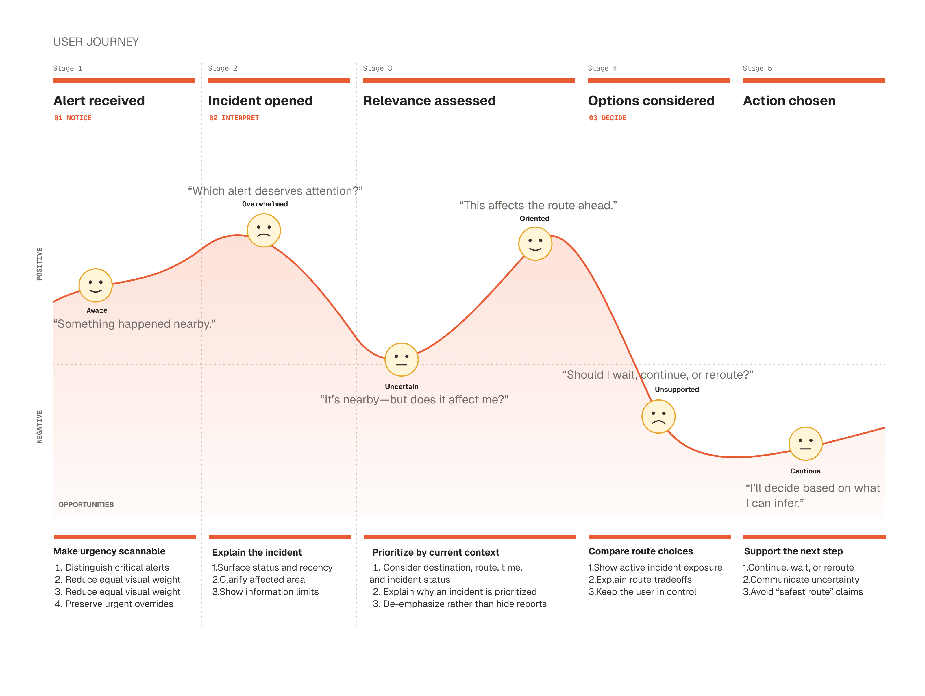
With so many incidents appearing nearby, I often struggled to determine which alerts actually deserved my attention. A report a few blocks away could feel urgent when it was near my destination, yet easy to ignore when it had no effect on my route. Distance alone did not determine relevance. Time of day, familiarity with the area, and what I planned to do next all shaped how I interpreted the same alert.
This made me question whether a safety platform should do more than report what happened.
02Research
Research goal
Understand the target users and how people perceive and react to local incident alerts, and identify the problem and potential solutions.
Research methods
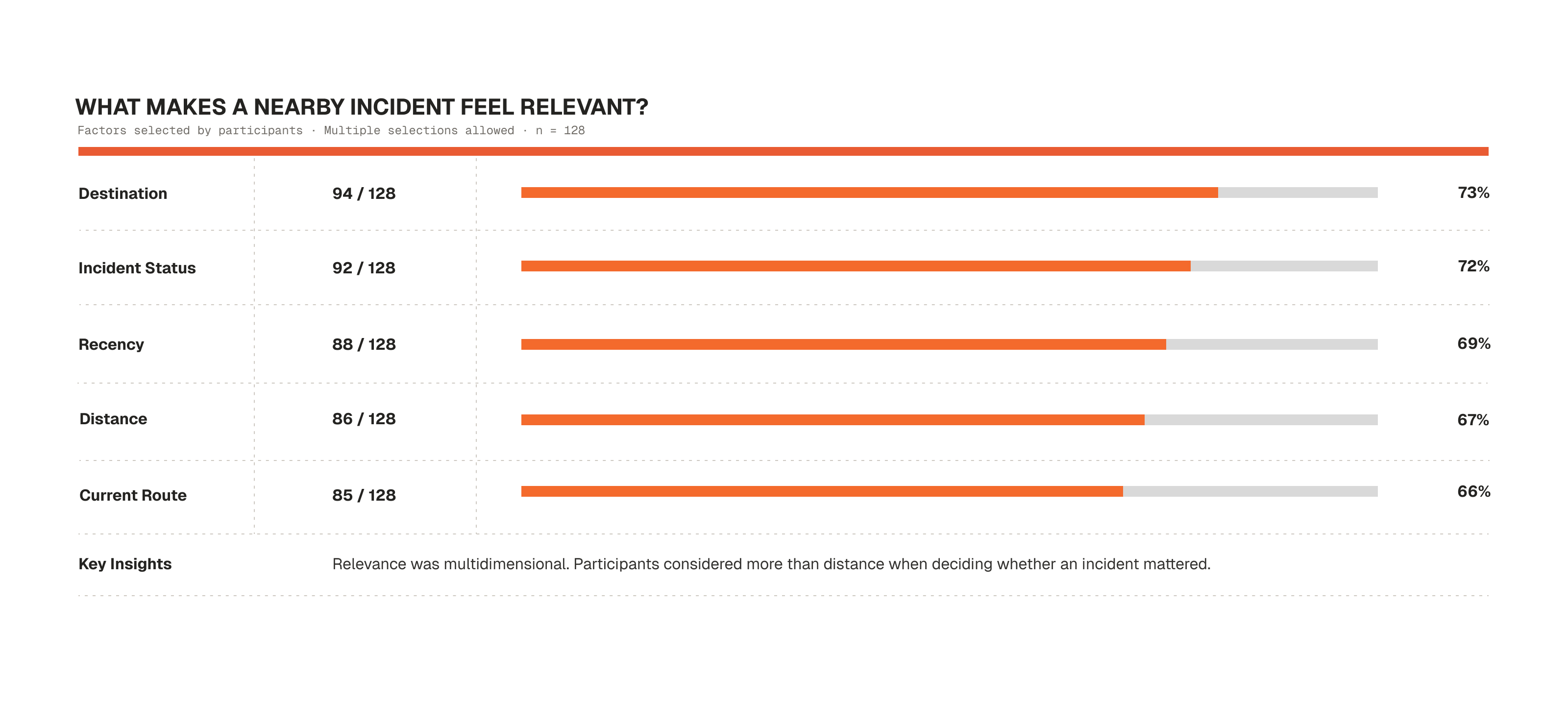
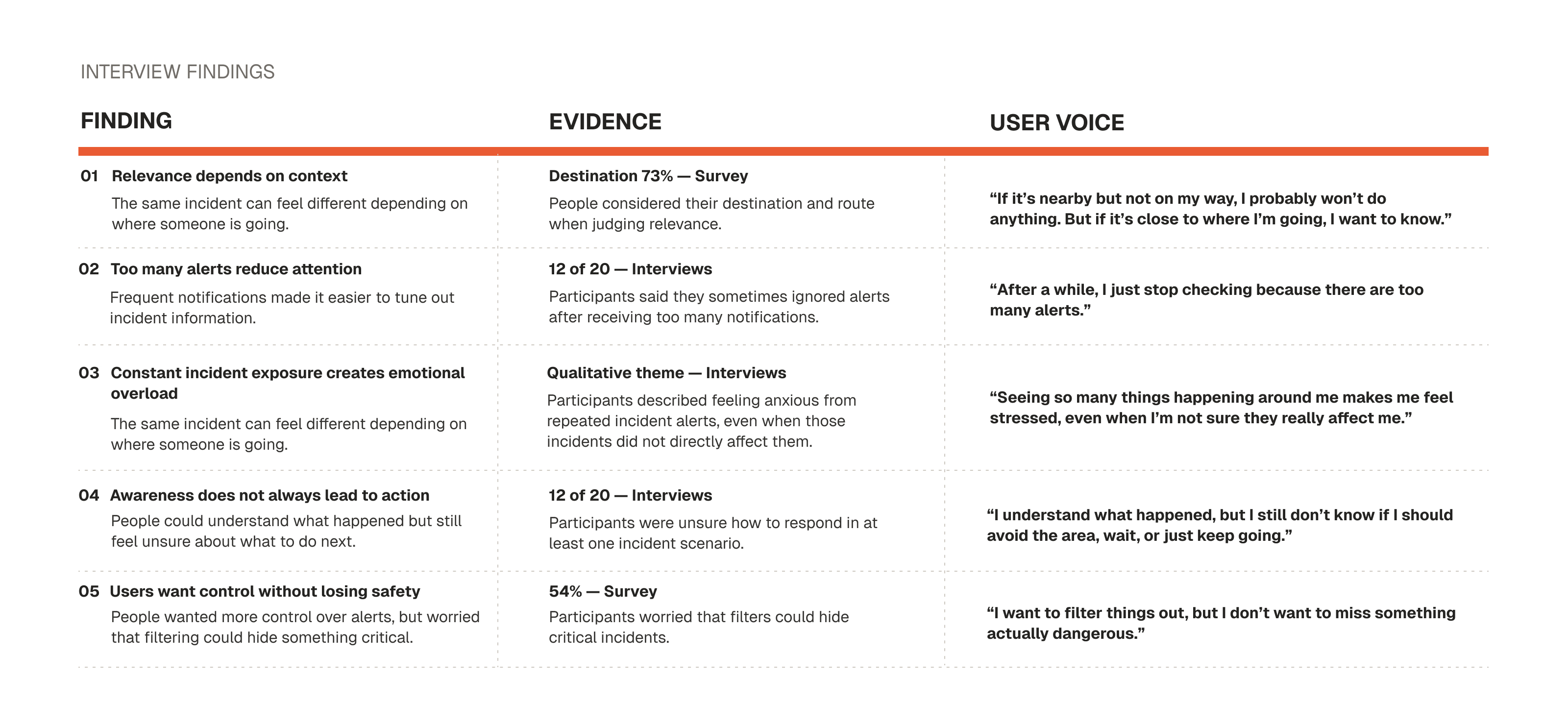
I combined 20 interviews, a survey with 128 people, and 8 route scenarios to see which signals shaped each decision.

Interviews
20 participants

Survey
128 responses

Contextual observations
8 scenarios
03Key findings
- Finding 1
Relevance is contextual, not just geographic.
- Finding 2
Awareness can stop before action.
- Finding 3
More alerts can produce less attention.
- Finding 4
Control needs a safety override.
04Design opportunity
Turn each research pattern into a clear design response.
- 01
Relevance is contextual, not just geographic.
Prioritize with route, destination, status and time rather than distance alone.
- 02
Awareness can stop before action.
Connect incident information to an immediate decision.
- 03
More alerts can produce less attention.
Reduce visual competition while keeping surrounding reports available.
- 04
Control needs a safety override.
Keep critical nearby incidents visible and explain every override.
05Solution overview
Two connected features create a clearer path from awareness to action.
06Feature 01
Prioritize incidents without creating false absence.
User problem
Reports compete for attention even when they have different relevance to the current plan.
Design response
Filter by type, risk level, time range and radius while dimming—not removing—other reports.
Key interaction
A visible safety override keeps critical nearby incidents prominent and explains why.
Important design decision
Risk and personal relevance use different signals.
Red is reserved for active critical risk. Hierarchy, labels and neutral states communicate personal relevance.
Prototype sequence
Filter → review → understand the override
- 01
Open filters from the map.
- 02
Choose incident type, risk level, time range or radius.
- 03
Review matching reports at full emphasis.
- 04
Keep other reports visible at lower emphasis.
- 05
See why a critical nearby incident overrides the filter.
Expected user value · Less visual competition, clearer relevance and continued access to critical context.
07Feature 02
Make the route tradeoff visible before the decision.
User problem
An incident can be understood without clarifying whether it affects the route ahead.
Design response
Compare lower exposure, balanced and fastest options using currently reported incidents.
Key interaction
Show time beside exposure, then let the user inspect the reports behind each route.
Avoids more active incident areas.
Weighs travel time and potential exposure.
Discloses nearby active incidents.
Important design decision
“Lower exposure” is not a safety guarantee.
The route explains the reported incidents it uses, acknowledges changing conditions and asks before rerouting.
Prototype sequence
Compare → inspect → choose
- 01
Enter a destination and compare route priorities.
- 02
Review travel time beside reported incident exposure.
- 03
Open the reports behind each route.
- 04
Choose lower exposure, balanced or fastest.
- 05
Accept or decline a reroute when a new incident appears.
Expected user value · A more informed route choice without removing agency or overstating certainty.
08Interactive prototype
From a nearby report to a route decision.
Use the controls to filter incidents, compare route priorities and test system states.
Nearby incidents
Nearby now
12 incidents nearby
09Testing & iteration
Evaluate understanding, not just task completion.
Evidence boundary
The available project files do not document participant profiles, sample size or quantitative usability results. The section below preserves the recorded evaluation tasks and design changes without adding unsupported impact claims.
What was evaluated
Whether people understood filtering, visibility, route tradeoffs and uncertainty.
Who participated
Not documented in the available source material.
Tasks
Six comprehension checks
- Explain what changed after applying a filter.
- Recognize that dimmed incidents remain available.
- Understand why a critical incident stays visible.
- Compare travel time with reported incident exposure.
- Distinguish lower exposure from guaranteed safety.
- Respond to a new incident during navigation.
Recorded changes
Issue → design change
- 01
Reports disappeared after filtering.
Keep nonmatching incidents visible at lower emphasis and explain the state.
- 02
Risk and personal relevance used similar signals.
Reserve red for critical risk; use hierarchy and labels for relevance.
- 03
“Safest route” implied certainty.
Use “Lower exposure” and disclose the reports and limits behind the route.
- 04
Automatic rerouting reduced control.
Show the time tradeoff and ask before changing the route.
10Outcome
A stronger path from awareness to action.
Prioritize
Relevant incidents move forward without erasing surrounding context.
Understand
Status, time, destination and route make relevance easier to interpret.
Decide
Route options expose time and incident tradeoffs while preserving user choice.
The concept does not remove uncertainty. It makes the available context and its limits clearer.
11Reflection
Safety recommendations must communicate what they cannot know.
More urgency would not have made the experience more useful. The harder problem was presenting incomplete information without making it sound certain.
Next, I would test the concept with public-safety specialists and people across different cities, mobility needs, levels of neighborhood familiarity and stressful real-world conditions.
The product should not tell people what is safe. It should show enough context for them to decide what makes sense for their own trip.